


SugarCRM has been hard at work concocting the perfect fusion of flash and substance that is the new Sugar UX for their mobile and web products. Today, we take a look at some of these new design elements and the care and thought that goes into the process for evolving a truly immersive, engaging, and intuitive Sugar experience.
Putting the ‘User’ in User Experience
Since its inception in 2004, SugarCRM has been constantly evolving and incorporating new features to cater to its diverse and ever-growing customer base. However, these additions often came at the expense of the User Experience. Moreover, feedback from customers suggested that they found the UX cluttered and complicated, and the UI outdated and inefficient.
The SugarCRM User Experience team lead by Brian Ng sought out to identify and address these issues by trying to comprehend the customer’s perspective. A rigorous heuristic evaluation of web and mobile products allowed them to identify issues in the UX and a competitive analysis revealed layout inefficiencies.
The Root of the Design Problem
The rigorous evaluations made it clear to the team which issues were the most critical and needed to be addressed first. They found that the dark gray text on the light gray background dealt a major blow to legibility. They also needed to do away with the heavy blacks and gray linen to give the CRM a more refreshing look and feel. Sugar Mobile was also plagued by the same blacks and grays and inconsistent button positioning across different screens was hindering productivity.
The New Sugar User Experience
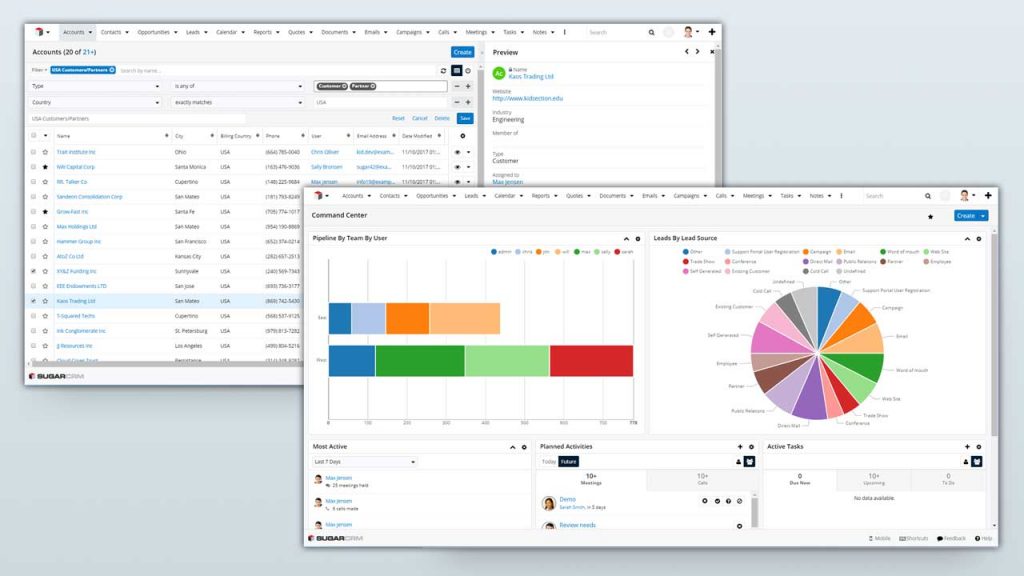
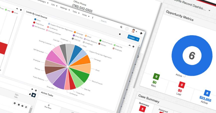
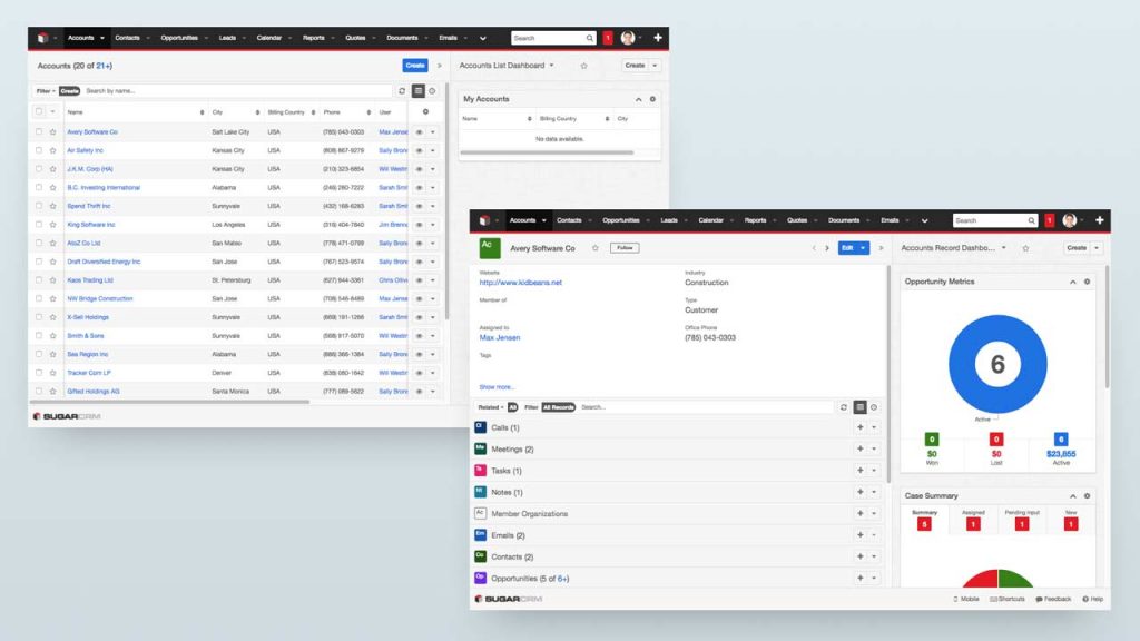
Establishing an intuitive, coherent experience that would meet the expectations of a modern workforce while still reflecting the Sugar brand was their primary objective. All the team’s decisions were informed by three design principles: Clear, Consistent and Efficient. After implementing, refining and testing various concepts based on these, the team unveiled their efforts at SugarCon 2016 for the first time. Needless to say, the crowd’s response was overwhelmingly positive. They adopted Open Sans as the Sugar UX base font for its open, neutral type shape and friendly appearance. Gone were the drab blacks and grays of yester-UX and replaced with a more refreshing and welcoming color palette. The brighter, lighter and popping colors on top of a clean white background made the experience easier on the eyes and suitable for extensive use.
The Bottom Line!
Fast forward to the present day, this new experience has diffused throughout the SugarCRM ecosystem for more coherence and cohesion across all platforms. First making its way to Sugar Mobile, the new UX has been a focal point of the recently released SugarCRM Winter ’18 release. The new visual design language has been documented in a Style Guide that will empower customers and partners to implement the new SugarUX consistently and effectively. This is only the first phase of a sweeter Sugar and SugarCRM will continue to build upon this in future releases and updates.
Being a SugarCRM and Salesforce Certified Partner, Rolustech is your one-stop-shop for all things SugarCRM. For any queries regarding the Sugar 7.11 Winter ’18 Release or for a free CRM Consultation Session, be sure to contact us. We will be happy to assist you!

